Some Notes on Pigments
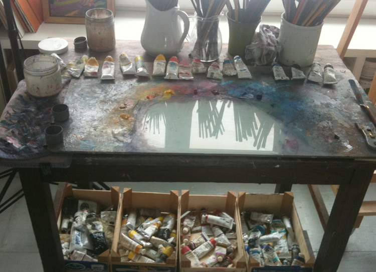
Pigments are to a painter what ingredients are to a chef. I stock my studio shelf with tubes of color in the same way that a chef fills a larder with the foodstuffs that are essential to her cooking. The chef knows that a pale and tasteless tomato will not make a flavorful sauce, and I know that cheap paint loaded with binder will not produce a clean, clear hue. The chef knows that if she buys every new condiment that hits the grocery shelf, her larder will become disorganized and her cooking confused. I know that I really don't need to order those tubes of "Pink Moonlight" or "Pearly Stardust" watercolor that looked so appealing in the latest catalog.
Here are my top five tips about pigments:
1. Know the names and brands of the pigments on your palette. Painters say "I'm using Sennelier Permanent Alizarin Crimson", not "uuhhh...that's some kind of red..."
2. Build your palette around a wide range of primary colors (reds, yellows and blues) and a few secondary colors (violets, greens and oranges.) If you have a wide range of primaries, you can mix just about any secondary or neutral color ("neutrals" are blacks, browns and greys).
3. Make charts that show all of your pigments, both fully saturated (strong, pure color) and as tints (mixed with water if watercolor, and with white if oils). Until you're familiar with the value range of your colors, refer to these charts when you paint.
4. Buy "artist's grade" paint even if you're a student. Economize by buying a more limited range of colors (say, just a set of primary colors) rather than cheap paint with less color intensity.

Not that I don't now and then dip into Dianthus Pink or Sevres Blue--but both of these oil pigments were added to my palette because they contribute distinctive color that is difficult to mix, not because of their sexy names.
5. Only add a new pigment to your palette if you can't mix the new color from the existing pigments you already have. The word "intimacy" comes to mind when I think about my palette. I really know my colors, with all their personalities, abilities and quirks, and I don't want to spoil our relationship by promiscuously adding tubes of attractive-sounding but unnecessary paint.
What specific pigments do I use?
The 20-80 rule applies to pigments: I use 20% of my pigments 80% of my painting time. Here are my primaries, from which I can mix just about every other color I need:

Watercolor swatches from left to right: Naples Yellow, Aureolin, Cadmium Lemon, Cadmium Yellow Pale, Raw Sienna
These yellows shown above appear quite similar, but each brings something unique to earn its place on my color palette. Naples Yellow is my most opaque watercolor pigment, and with it I can mix cool, light greens (more on color mixing in a later post.) Aureolin and Cadmium Lemon are both bright and have a greenish cast, but Aureolin is much more transparent and not quite as as pure a yellow as its neighbor. Cadmium Yellow Pale is opaque and leans to orange, and Raw Sienna is transparent, and extends my yellow range into more neutralized "earth tones".

Watercolor pigments from left to right: Cadmium Red, Quinacridone Coral, Permanent Rose, Carmine, Permanent Alizarin Crimson
As with yellows, the main difference between these reds on my palette is whether they lean to yellow (like Cadmium Red and Quinacridone Coral) or blue, as the three on the right do. They also vary widely in transparency, with Cadmium Red the most opaque, and Quinacridone Coral the most transparent.

Watercolor pigments from left to right: Cobalt Blue Light, Ultramarine Blue, Cobalt Turquoise, Helio Cerulean, Prussian Blue
Blue pigments vary widely in hue, with the two on the left edging towards violet, and three on the right leaning strongly into green. Cobalt Blue Light is extremely transparent, while Cobalt Turquoise is very opaque. You can also see that blues show strong value (dark and light) differences.
As we'll see in future "Painting Notes" posts, these very individual qualities in pigments will all come into play as they combine to make a painting.
Susan Abbott, "Dusk from Les Bassacs", watercolor
Following is my full palette of pigments in watercolor and oil:
I want to emphasize that pigment choice is highly personal, there's no right or wrong palette of colors, and you will develop your personal palette from both other painter's color lists and your own experimenting.
As there's no industry-wide standardization in pigment manufacture, colors with the same name can vary widely from brand to brand. For some pigments I buy specific brands (Winsor Newton (WN), Schmincke (SCH), Daniel Smith (DS).
My watercolor palette: Naples Yellow, Aureolin (WN), Cadmium Lemon, Cadmium Yellow Pale, Cadmium Orange, Pyrol Orange (DS), Cadmium Red, Permanent Alizarin Crimson (WN), Permanent Rose (WN), Carmine (Sch), Winsor Violet (WN), Cobalt Blue Light (Sch), Ultramarine Blue, Helio Cerulean (Sch), Cobalt Turquoise (Sch), Prussian Blue, Viridian Glowing (Sch), Raw Siena, Quinacridone Gold (DS), Quinacridone Sienna (DS), Burnt Umber.
In oils, I buy Williamsburg (WB), Holbein, Winsor Newton, Rembrandt, Old Holland, and Gamblin (GA) pigments, depending on what's on sale.
My oil palette: Titanium White, Zinc White, Flake White, Naples Yellow Italian (WB), Italian Yellow Ochre (WB), Cadmium Yellow Pale, Cadmium Yellow Medium, Cadmium Orange, Cadmium Red, Dianthus Pink (WB), Permanent Rose, Permanent Alizarin Crimson, Cobalt Blue Light (Sch), Cerulean Blue, Ultramarine Blue, Prussian Blue, Sevres Blue (WB), Cobalt Teal (GA), Viridian Green, Indian Red, Burnt Sienna, Burnt Umber.
Your comments are welcome below! Feel free to leave your name and website address.