Triangle vs. Circle
Back in the day, and maybe still, kids graduated from elementary school with a little color theory under their belts. We learned during weekly afternoon art class that red, yellow and blue were the three "primaries", and from these we could make purple, orange and green, the "secondaries".
It was a nice, clear theory that I thought, until I was an art school freshman in 2d design class, was true.
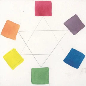
Secondary mixes from Cadmium Red, Ultramarine Blue and Cadmium Yellow
Experimenting that night in art school, I tried another red on my palette, Alizarin Crimson, which was a bit more purplish, and added Prussian Blue, which had green overtones.
Hoping for a brighter green, I substituted Cadmium Lemon, which leaned towards green, for the more reddish Cadmium Yellow Pale.

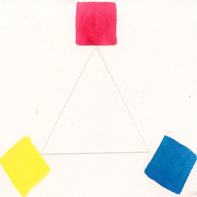
Cadmium Red, Ultramarine Blue, Cadmium Yellow Pale
The problem with the primary triangle, I found during color mixing exercises, was the secondaries. The primaries were pure, but when I mixed two together, the resulting violet and green were decidedly neutralized--that is, muddied.
Like the story of the pilgrim's first Thanksgiving learned in second grade, my elementary color theory was proving to be lacking in accuracy.
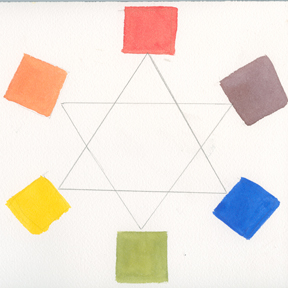
Permanent Alizarin Crimson, Prussian Blue, Cadmium Lemon
Permanent Alizarin Crimson, Prussian Blue and Cadmium Lemon mixed for secondaries
I found that mixing Cadmium Lemon Yellow and Prussian Blue did give me a very clean green, and that Alizarin Crimson and Cadmium Lemon mix to a reasonably pure orange. But, once again, the tricky mix was violet. Alizarin Crimson and Prussian Blue make a very nice mauve-grey, not a vibrant purple. So there I was, a freshman in art school working at midnight on a color assignment due at 9:00 am-- it was time to reinvent the wheel...

Isaac Newton's spinning color wheel, c. 1670
Like much physics-based color theory, this demonstration that colors mix optically to white doesn't have practical use for painters--all of our colors, if mixed on our palette, result in a puddle of grey. Still, artists embraced Newton's new concept of circular color relationship. But systems of color codification for artists, like Boutet's twelve hue wheel, were often confusing, if attractive.

Goethe's color wheel, 1810
Enter the brilliant French chemist Eugene Chevreul, who after a successful career studying animal fats was hired by the Gobelins tapestry works to figure out why their dark dyes looked dingy when woven into full-color fabric.
His research led him to an expanded color wheel, and to a revolutionary study of color harmony and the power of color contrast .

Delacroix, "Woman with a Parrot" (detail), 1827
The Impressionists showed us nature as a living color wheel: yellow--green grass next to green--yellow, green, and green--blue foliage, next to pink paths with shadows that moved from red--violet to blue--violet. With the innovation of oil and watercolor pigments that expanded palettes to a full spectrum of hues, artists were now equipped to put new color theories to the test.

Winslow Homer, "Flower garden and Bungalow, Bermuda", 1899
Though it didn't do me much good that night, I discovered later that the color wheel already had a four hundred year old history that began with Isaac Newton. His investigations with prisms, which led him to link light and color in a new way, also demonstrated that color was a spectrum that could be arranged in a disc. Newton also showed that this disc, if spun quickly enough, was perceived by our eye as white.
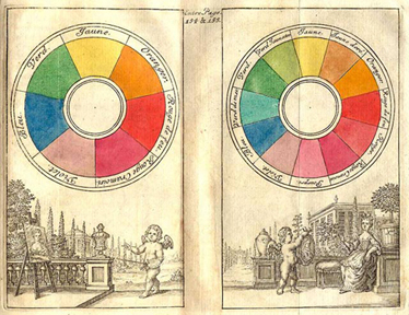
Boutet's color wheels, 1708
The color wheel proved to be a rich source of inspiration for scientists and philosophers, who found musical and mathematical analogues in color relationships.
The German writer Goethe, exploring the psychology of color perception, argued for a more subjective approach to color than Newton had provided.
Goethe's observations that atmospheric conditions influence color in nature, that shadows hold color, and that colors exert a strong influence on each other, may have been pooh poohed by physicists, but proved extremely influential to future generations of painters.
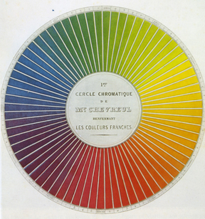
Chevreul's chromatic diagram, 1855
Eugene Delacroix was one of first painters to use new theories based on the color wheel. His use of complements (opposites), analogous (neighboring), and colorful shadows led 19th century European painting into a more vibrant, more emotional, and also more accurately colorful visual world.

Claude Monet, "Park Monceau", 1878
A well-worn copy of Chevreul's treatise was Winslow Homer's bible as he taught himself to paint in oils and watercolors. As Homer said in his no-nonsense American way, "A painter without color theory is like a mechanic without tools".
These new theories of color relationships always came back to an understanding of the color wheel.
So, from that time as an art student trying to complete a 2D assignment, to my years since as a painter, how have I myself used this all-important color wheel?
I'd have to agree with Winslow Homer that an understanding of color relationships is fundamentaI--but unlike him, I have a hard time comprehending written color theory, which I often find vague and confusing.
So over the years I've developed, not from books but from observation, practical experience, and trial and error, my own color wheel that underlies my approach to color mixing and composition.

Alizarin Crimson, Prussian Blue, Cadmium Lemon
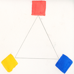
Cadmium Red, Ultramarine Blue, Cadmium Yellow Pale
My concept is based on using not three, but six variations of primary colors: the two sedentary triangles of separated primaries are now combined into one fluid wheel of paired primaries that move seamlessly when mixed together into pure secondary colors.
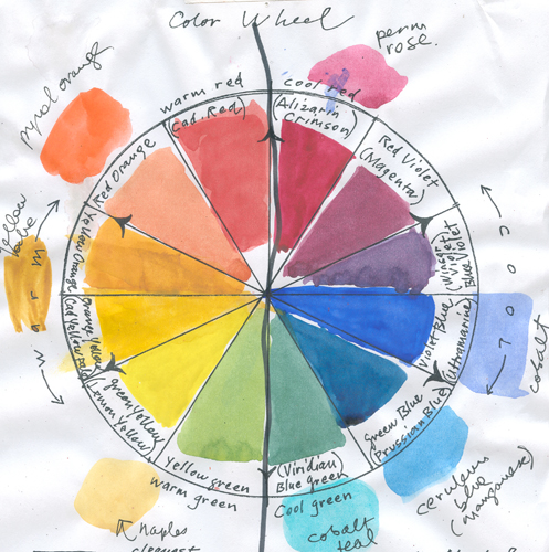
Susan Abbott's color wheel: starting at top left Cadmium Red, Permanent Alizarin Crimson, mixed red-violet, mixed blue-violet, Ultramarine Blue, Prussian Blue, mixed blue-green, mixed yellow-green, Cadmium Lemon, Cadmium Yellow Pale, mixed yellow-orange, mixed red-orange, with additional palette colors in outer ring
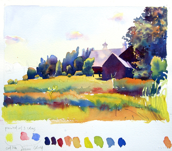
Susan Abbott, watercolor study with limited primary palette of Cadmium Lemon, Alizarin Crimson, and Cobalt Blue
Artists are different from theoreticians, since we are in the business of making things. For us, in our studio or in the field, palette, pigments and color wheel are all united into a mental and physical, emotional and analytical tool kit, ready for the hard work of creating a painting.
Your comments are welcome below! Feel free to leave your name and website address.